BP p.l.c.
Fuel Supply Planning Platform
Role
Experience Designer
Team
1 Experience Designer
3 Engineers
2 Data Specialists
1 Product Owner
My contribution
Discovery & User Interviews
Co-design sessions with users
End-to-end product design
Timeline
18 Weeks
The problem
My role
The outcome
Overview
I led the experience strategy and end-to-end design for bp's Fuel Supply Planning Platform. It's the system supply planners and operational teams sit inside every day to coordinate fuel across the network.
The brief was to take a fragmented planning ecosystem and turn it into one cohesive experience. Reduce the complexity of high-pressure decisions, give planners better visibility into what's happening, and put in place a foundation the business could keep building on.
Brand utilisation
The platform supports time-sensitive decisions where errors carry real downstream cost. The experience needed to feel:
- Calm under operational pressure
- Clear and data-confident
- Efficient without feeling robotic
- Trustworthy for high-stakes decision-making
- Consistent across complex workflows
- Human-centred while supporting technical users
Across the visual and interaction language, clarity, hierarchy, and decision support came first. Decoration came second, if at all.

Challenge
Fuel supply planning is unavoidably complex. Teams coordinate supply, logistics, operational constraints, forecasting, and shifting business conditions in real time. The toolset had grown incrementally over many years, and the experience had drifted with it.
- Fragmented ecosystem. A single planning task could span several systems, spreadsheets, dashboards, and chat threads. Each with its own logic.
- High cognitive load. Critical decisions were made quickly inside dense interfaces where the most important signal was often buried.
- Lack of consistency. Different tools used different patterns, terminology, and visual structures. That slowed onboarding and eroded confidence over time.
- Operational pressure. Time-sensitive decisions carry real downstream cost, so the experience needed to actively support clarity, not just contain information.
- Scalability. New teams and workflows kept arriving. Any new design needed to make the system simpler as it grew, not more complex.
The real challenge wasn't redesigning a few screens. It was building a cohesive experience strategy that could hold usability, technical reality, and business-critical planning together inside one product.
Research
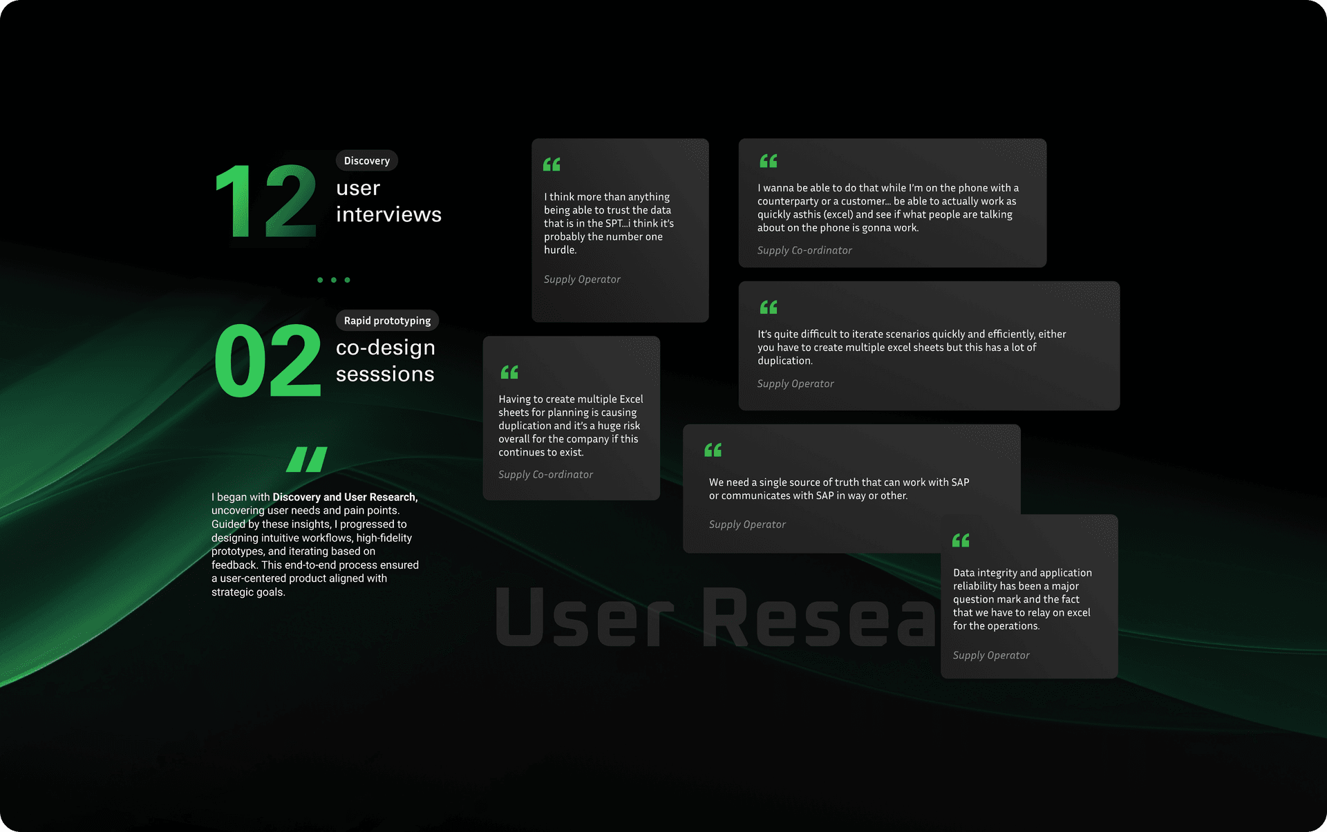
I led discovery to understand fuel supply planning as it's actually practised, not as it's documented, testing an early assumption that the core problem was trust in the data, not missing capability. Across 12 user interviews and 2 rounds of co-design sessions with planners, operations stakeholders, business analysts, and technical teams, we mapped the real workflows and the workarounds that had quietly become load-bearing.
What we learned
- Critical information lived across disconnected platforms. Planners stitched it together from memory and habit.
- Spreadsheets had become an unofficial source of truth. Fragile, duplicative, and high risk.
- Workflows varied meaningfully between teams, but the interfaces treated them as identical.
- Under time pressure, dense screens and inconsistent patterns added cognitive load instead of signal.
- Planners wanted confidence in forecasting decisions. Not more features.
The work brought business and technical stakeholders around a shared view of operational complexity, and made the case for where experience improvements would do the most good.
Design System
I introduced a systems-led approach so consistency and scale stopped being a per-screen negotiation. Shared foundations like tokens, patterns, components, and behaviours supported multiple operational products while staying flexible enough for domain-specific needs.
Core principles
- Consistency at scale. Reusable patterns and layouts cut friction across workflows and made the product feel familiar even on first use.
- Data-first design. Information hierarchy, readability, and operational clarity came ahead of decoration.
- Reduced cognitive load. Standardised behaviours kept attention on the decision, not the system.
- Modular architecture. Components and patterns built to evolve alongside future capabilities.
- Cross-functional alignment. Built alongside product, engineering, and business stakeholders so it could ship realistically without watering down the experience.
The system worked as an operational framework. It made cohesive product experiences across the planning ecosystem possible, and it made them faster to ship.
Solution
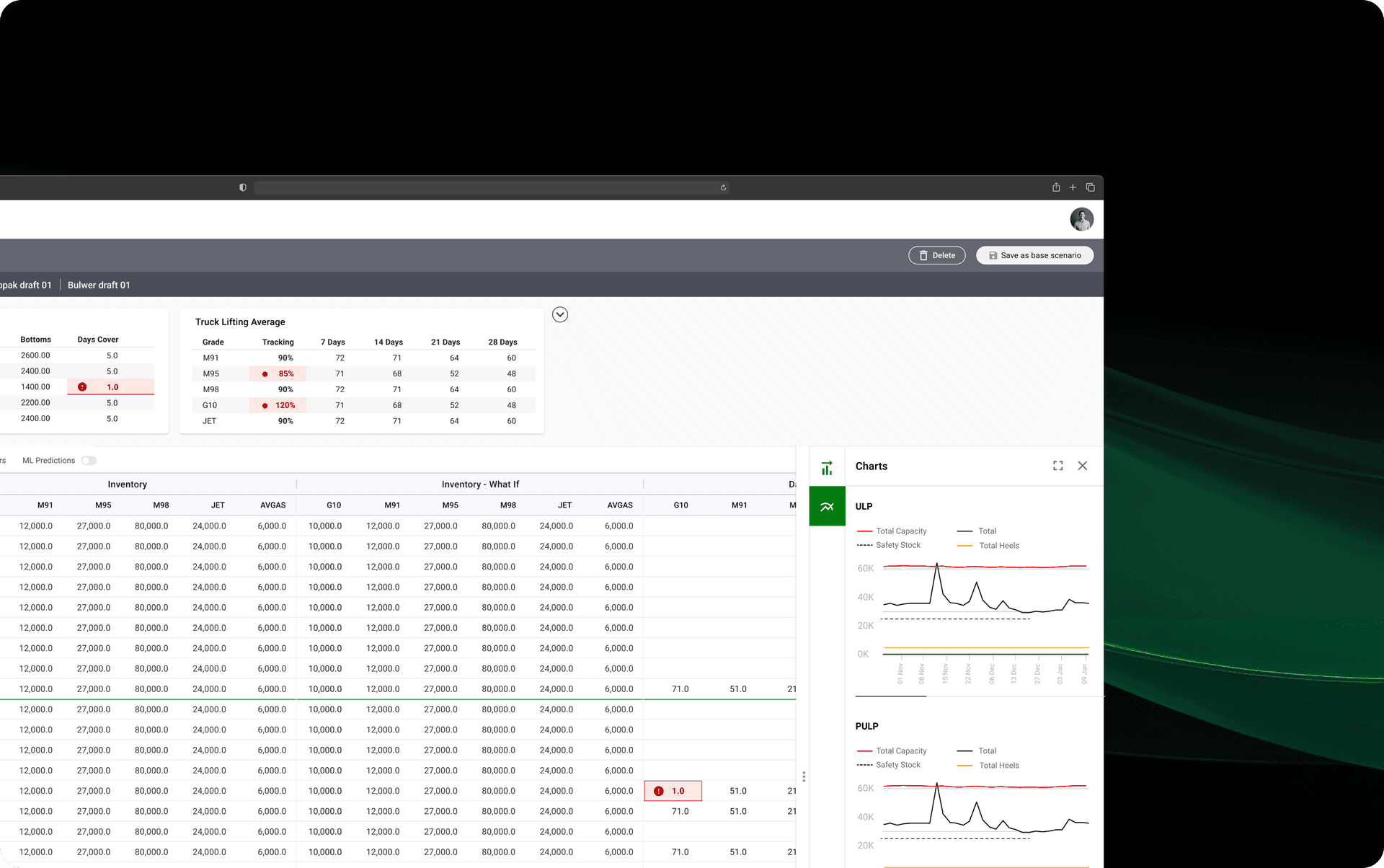
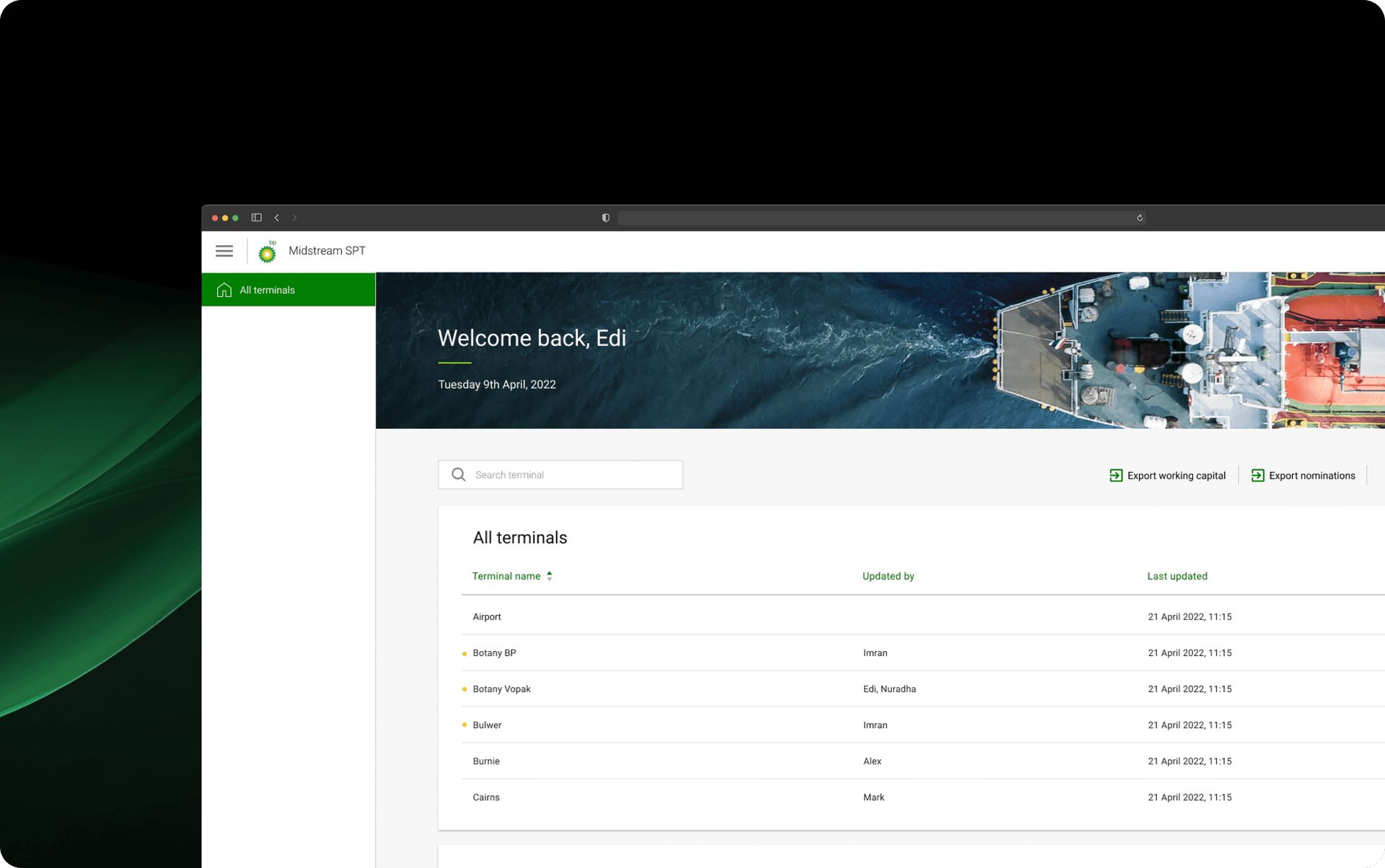
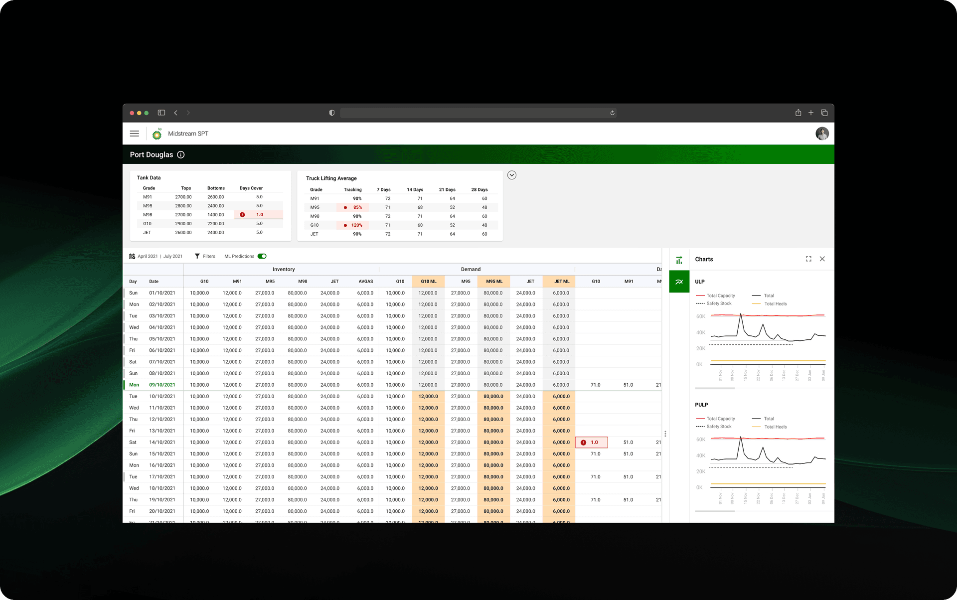
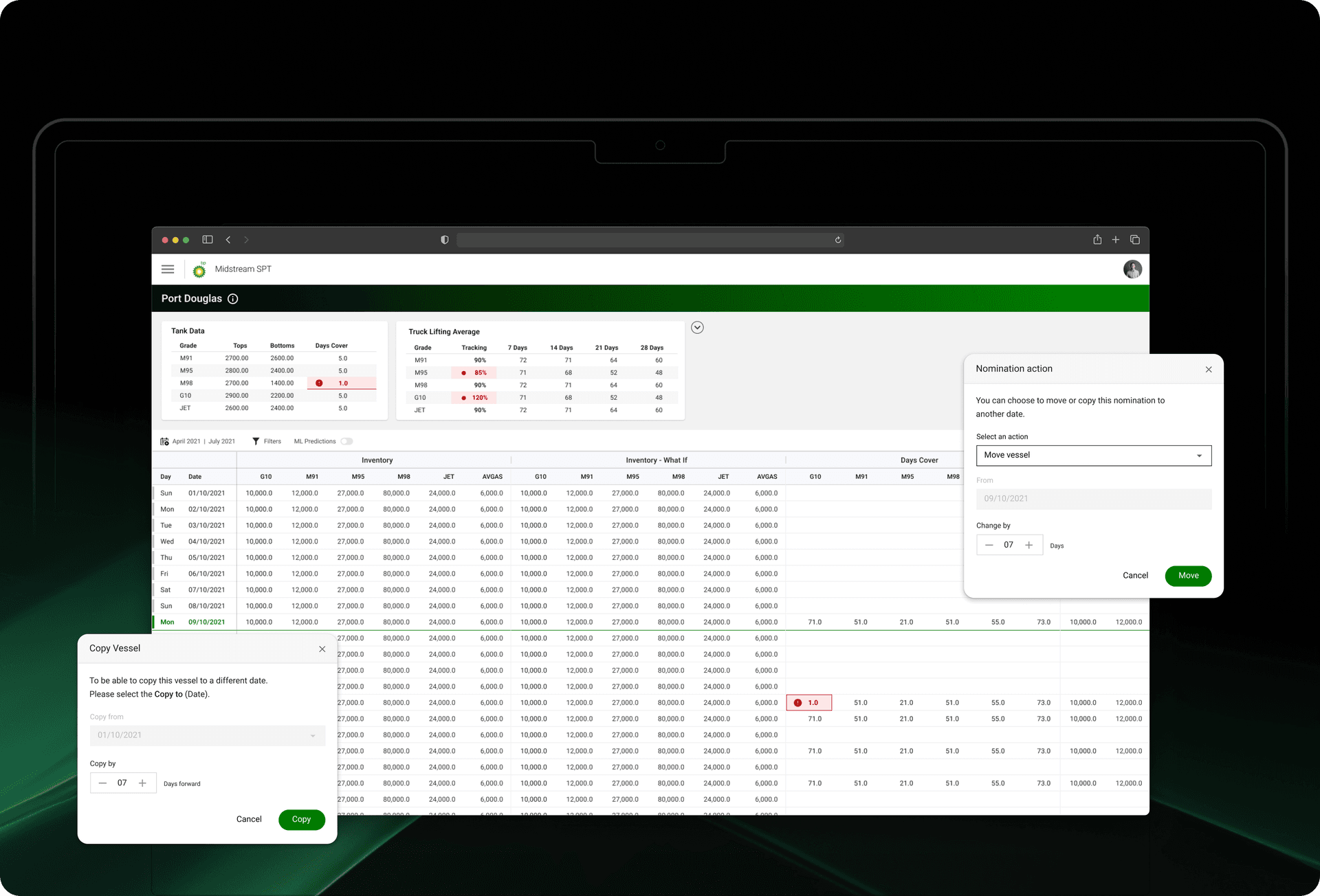
I led the end-to-end experience design that turned operational complexity into a single, unified planning surface. I designed the terminal overview, the tank-data and daily inventory grid, and the what-if scenario view in Figma, pairing with engineering through the build. Clearer workflow structure, better data visibility, and more intuitive interaction patterns supported faster, more confident decisions.
What changed
- A unified operational experience. Fragmented systems and external workarounds gave way to a connected planning environment.
- Sharper information hierarchy. The operational signal planners actually act on came to the surface.
- Simplified workflows. Fewer steps, less duplication, more flow.
- Scalable foundations. Reusable experience patterns ready for the next set of products in the ecosystem.
- Collaborative delivery. Built end-to-end with product, engineering, business, and operational teams.
The intended outcome
- Fewer costly planning errors, by making the state of the network legible at a glance instead of reconstructed across tools.
- Faster, more confident dispatch and forecasting calls under time pressure.
- Less reconciliation risk as teams move off ad-hoc spreadsheets onto one shared source of truth.
- A scalable UX and design system foundation that makes the next products cheaper to ship.
In the details
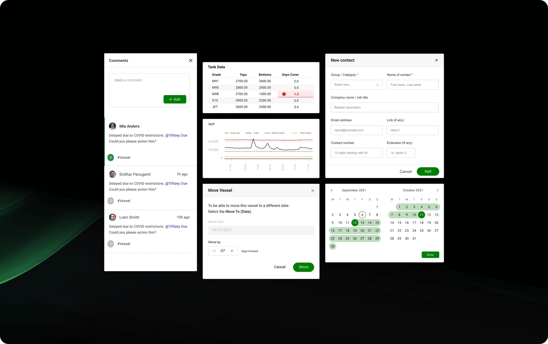
The daily inventory grid carried the most decision weight, so it got the most attention. I froze the tank and product columns so planners never lose context scrolling weeks out, surfaced tracking deltas inline, and embedded compact capacity charts beside the numbers, so the state of a terminal reads at a glance instead of being reconstructed cell by cell.
The work showed how UX strategy, systems design, and a real grasp of operations can turn complex enterprise workflows into experiences that feel both human and trustworthy.