Carell
Designing Movement with Meaning
Role
Lead UX/UI
Designer
Team
1 Experience Designer
2 Engineers
1 Product Manager
My contribution
Discovery & User Research
Visual Design
Prototyping
User Testing
Timeline
21 Weeks
The problem
My role
The outcome
Overview
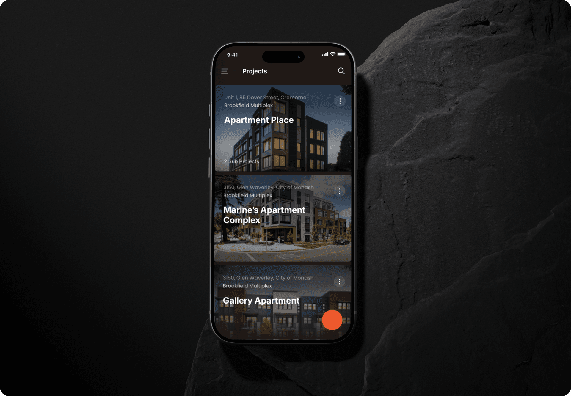
Carell is a mobile-first operations platform for joinery manufacturers and installation teams. I led the UX/UI design end-to-end, from on-site research through to a high-fidelity prototype the team could test, validate, and hand to engineering. The brief was to take a coordination problem stitched together by spreadsheets, phone calls, and paper job sheets, and turn it into a single, calm surface that works one-handed on a noisy site. I prototyped the full flow in Figma and tested it on real devices with production and site teams. I pressure-tested one assumption: that a single shared surface could replace the spreadsheets, calls and paper without anyone slipping back to the old way.
Challenge
Production floors, site teams, and office managers were operating in three different versions of reality. Before Carell, they coordinated by spreadsheets, phone calls, and paper job sheets, which meant:
- No real-time visibility of production or installation status.
- Frequent delays from missing information and unclear dependencies.
- High operational waste, from miscommunication to rework.
- Teams constantly “chasing updates” instead of doing meaningful work.
The opportunity was clear: create a single, intuitive interface that brings production floors, site teams, and managers into one shared source of truth.
Research
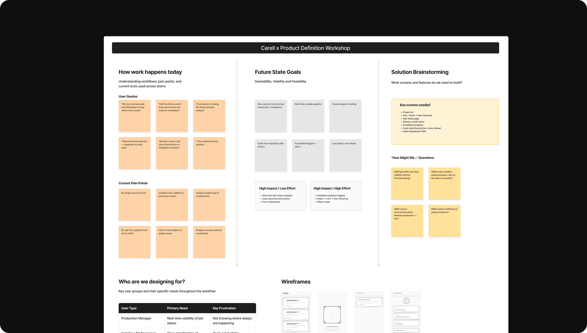
I immersed myself in real construction workflows, walking through joinery shops, observing installers, and mapping how jobs move from cutting benches to finished sites. From this, three design principles emerged:
- See the whole picture instantly. A project overview that surfaces stages, tasks, risks, and delays at a glance.
- Tap into the details only when you need them. Drill-down views for items, materials, checklists, and installation notes.
- Design for one-hand, on-site usability. Large touch targets, simplified actions, dark-mode support, and offline resilience.
These principles shaped a product that feels fast, grounded, and built for real-world environments: dusty workshops, noisy sites, and teams always on the move.
Solution
A simple interface for incredibly complex work.
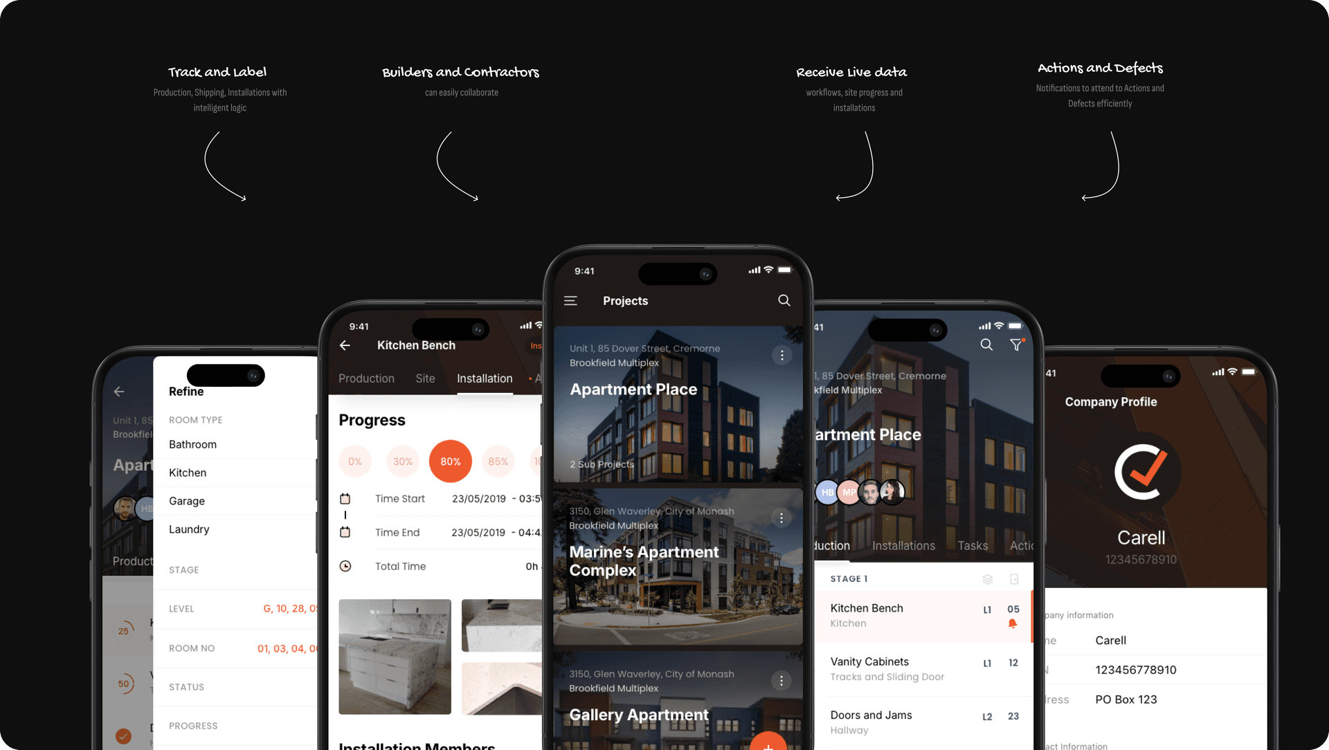
The result is a unified mobile platform that turns operational chaos into coordinated action:
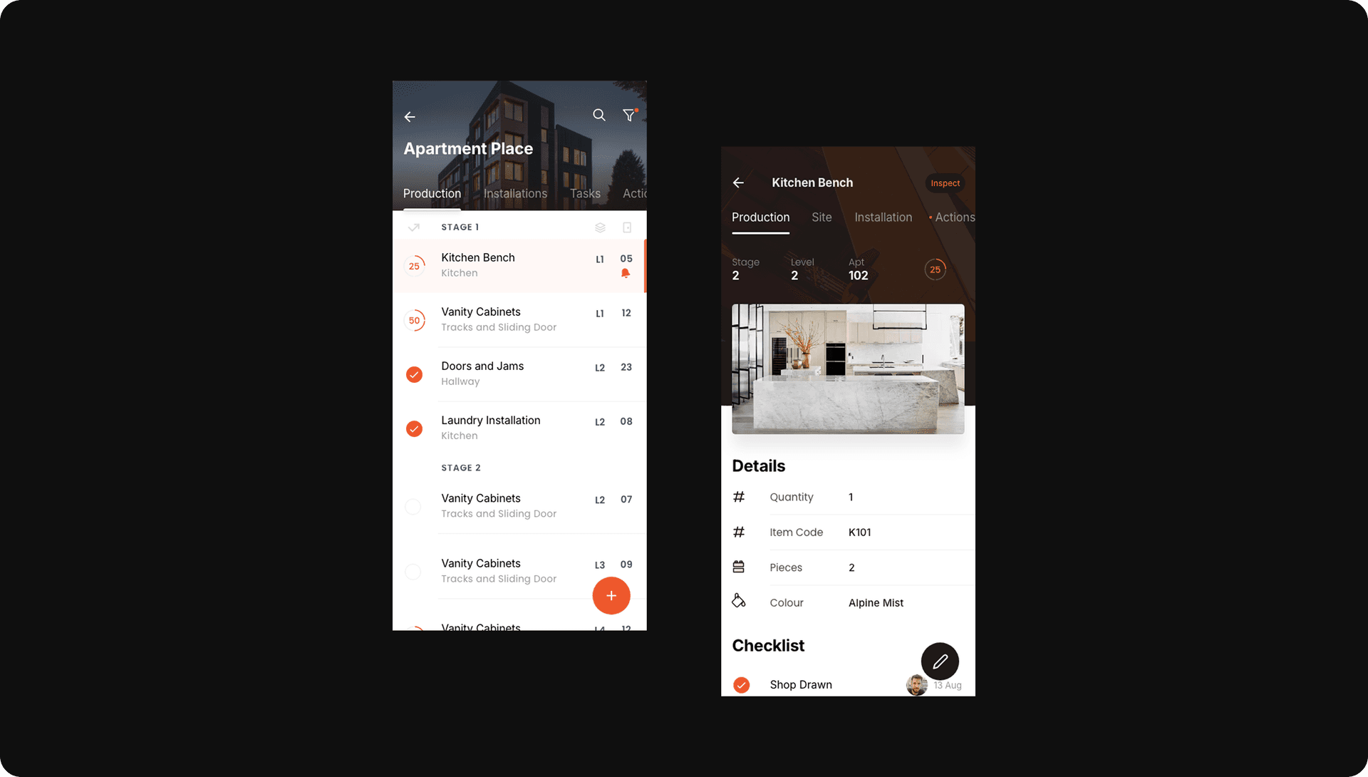
- Live project views showing progress across buildings, units, and rooms.
- Item-level tracking for every bench, cabinet, or installation component.
- Smart checklists and on-site logging for quality, issues, and photos.
- Real-time sync so office teams and installers stay aligned.
In the details
The on-site logging screens got the most craft. I sized tap targets for a gloved hand, kept the primary action reachable with one thumb, tuned a dark-mode palette that survives direct sun, and made photo-and-defect capture work offline, so a fresh slab of concrete or a dead signal never blocks an update. It queues and syncs the moment the phone reconnects.
Impact / Results
Carell moved from concept to a tested, high-fidelity prototype in 21 weeks, validated with the joinery and installation teams it was built for. The early signal: faster quotes, clearer ownership, and a measurable lift in the moments that drive conversion.
User impact
increase in quote-to-confirm conversion.
Speed
faster time-to-quote versus the prior spreadsheet flow.
Coordination
reduction in status-chasing calls between site and office.
Source of truth
unified platform replacing spreadsheets, phone calls, and paper job sheets.